Wednesday, March 4, 2015

A little bit about me...

Hi, my name is Brady Lilley.  I live in Mesa, Arizona but was born and raised in Prescott, Arizona.  Yes, I pronounce Prescott like Preskitt like any TRUE Arizonian would...just saying...I am a country girl through and though.  I love small towns, dirt roads, and actually being able to go star seeing at night.  I am the youngest out of 3 kids, and have one niece who is the apple of my eye.  My family is my everything, and no you don't have to be blood to be family.  

 I am excited to start my career as a teacher! I am currently attending Mesa Community College and Northern Arizona University Extended Campus to make my dreams of becoming a teacher a reality!!! I can't wait to teach! I currently work for Gilbert Public Schools at Desert Ridge Junior High School.  I'm a paraprofessional specialist in a multi-disability classroom, and I also work with several autistic students as well.  I love my job and wouldn't change it for the world!!! 

Tuesday, March 3, 2015

Activities

Here are some great websites with fun, interactive games on graphing!

http://pbskids.org/cyberchase/math-games/bugs-in-the-system/

http://www.kidsmathgamesonline.com/numbers/mathdata.html

http://www.abcteach.com/directory/subjects-math-graphing-647-2-1

http://www.the-best-childrens-books.org/teaching-graphs.html

•Searching on Pinterest, I also found some really great ideas!!! 


http://www.the-best-childrens-books.org/teaching-graphs.html

http://www.themeasuredmom.com/7-ways-to-make-a-graph-with-kids/#_a5y_p=1925658

http://www.childcarelounge.com/blog/dr-suess-birthday-ideas/

http://www.simplycenters.com/2012/04/jelly-bean-math-activities-freebie.html


All of these sites got my wheels turning!! I can't wait to teach these ideas!!!!

Monday, March 2, 2015

Box and Whisker

-A box-and-whisker graph is a graph that shows how far apart and how evenly data are distributed

it looks like this
Image result for box and whisker plot for kids
Minimum: is the lowest extreme of your data.
Lower quartile: is the median of your data starting at the minimum to the median of the original data.
Median: is the middle of the first set of data
Upper quartile: is the median of data starting AFTER the median of first set of data to the maximum.


This video I found was very helpful in explaining how to make a box and whisker plot.

http://youtu.be/CoVf1jLxgj4


Sunday, March 1, 2015

Videos and Pages

I think videos are a great resource!! Here are some videos I found very helpful!


https://www.youtube.com/watch?v=h3QoquxnfZk


https://www.youtube.com/watch?v=Qj2CF1XQDMY


Loved these sites!

http://www.mathgoodies.com/glossary/term.asp?term=box-and-whisker%20graph

http://www.mathsisfun.com/data/graphs-index.html

http://mrnussbaum.com/coolgraphing/
-Loved this site because it gives graphing print outs and its all set to common core standards!!!

Friday, February 27, 2015

Finding mean, median, mode, and range...


VOCAB!
-As you can see from the image above, I have the vocabulary words.  I like this picture because it's a great print out for the classroom, and is super cute!!! I am however going to go and list my definitions as well.

Mean: also known as the average.  To get the average you add all the data together then divide the sum by the number of data given.  

Median: is the middle.  If you don't have a middle number you add the two numbers in the middle of your data and divide by 2.  You do however, need to make sure that your data is in least to greatest order. 

Mode: this is the data that occurs most frequently.

Range: is the difference between the smaller and biggest number of the data.


How did she get the mean?
-You add up all the data then divide by the number of data given.  
-Total data given: 9  
*13+13+13+13+14+14+16+18+21=135  
-Now take 135 and divide it by 9  
*135/9=15

What about mode?
-You can have more than one mode.  If 14 was repeated 4 times, like 13 is, then you would have two modes. 

How did she get the range?
-The range is the Biggest number subtracted by the smallest number.
21-13=8

Wednesday, February 18, 2015

All About That Graph

-An important part of displaying data are visual illustrations.  These visual illustrations are different types of graphs.  Graphs such as: pictographs, circle graphs, pie charts, dot plots (also known as line plots), scatter plots, stem and leaf plots, frequency tables, histograms, bar graphs, and line graphs. 

-First lets take a look at some vocabulary you will see. 

            -Categorical Data: data that represents characteristics of object or individuals in groups.

            -Numerical Data: Data collected on numerical variables.
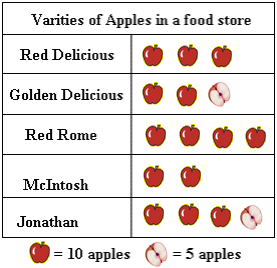
            -Pictographs: used to represent tallies of categories.
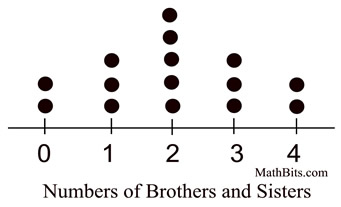


-Dot Plots/Line plot: provide a quick simple way to organize data.  Only use them when there is only one group of data and have less than 50 values.
                                    -Outlier: a point whose value is significantly greater than or less than others.
                                    -Cluster: Isolation group of point
                                    -Gap: large space between data points
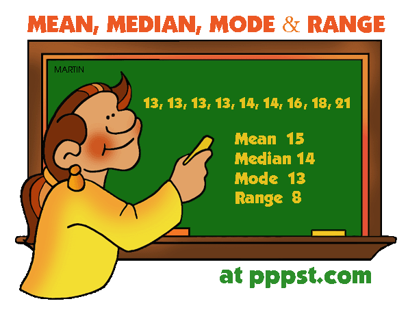
                                    -Mode: Data value3s hat occur the most often
                                             

            -Stem and Leaf Plot: a display where the data is organized by place value.
                   Image result for stem and leaf plot      Image result for stem and leaf plot


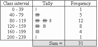
            -Grouped Frequency Table: Shows hoe many times data occurs in a range.


            -Histogram: Compare number of data items grouped in numerical intervals.  Order does matter.


            -Bar Graph: Compare number of data in grouped categories.  Order doesn’t matter.
                                         Image result for bar graph


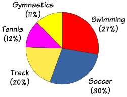
            -Circle Graphs: Circular region partitioned into sections.  Each section equals a part or percentage of the whole.


            -Line Graphs: Consecutive data points are connected by line segments.


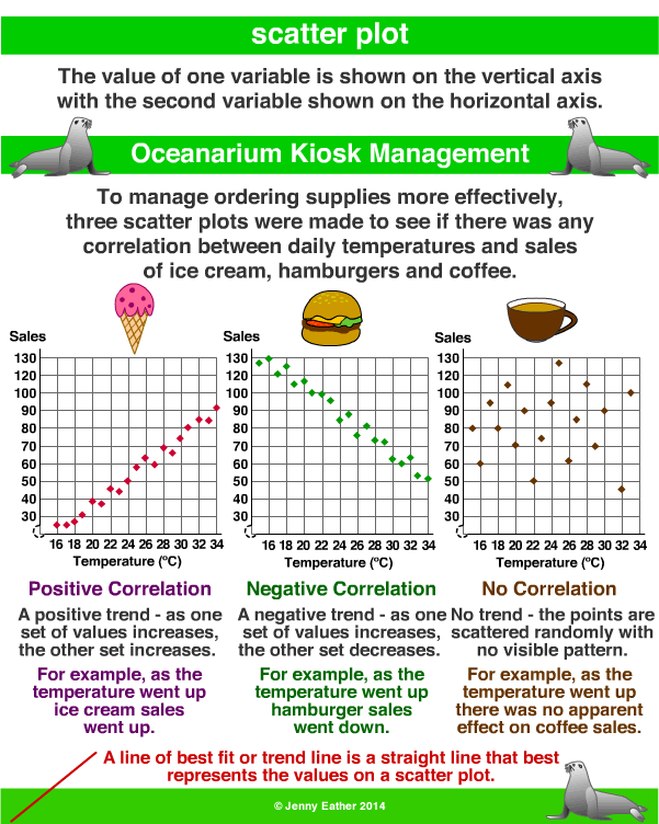
            -Scatter Plots: Relationship between variables cannot be depicted by a broken line.