-An important part of displaying data are visual
illustrations. These visual
illustrations are different types of graphs.
Graphs such as: pictographs, circle graphs, pie charts, dot plots (also
known as line plots), scatter plots, stem and leaf plots, frequency tables,
histograms, bar graphs, and line graphs.
-First lets take a look at some vocabulary you will
see.
-Categorical
Data: data that represents characteristics of object or individuals in groups.
-Numerical
Data: Data collected on numerical variables.
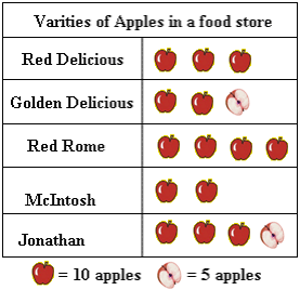
-Pictographs:
used to represent tallies of categories.
 |
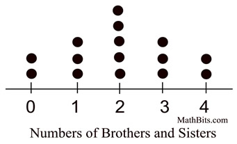
-Dot
Plots/Line plot: provide a quick simple way to organize data. Only use them when there is only one group of
data and have less than 50 values.
-Outlier:
a point whose value is significantly greater than or less than others.
-Cluster:
Isolation group of point
-Gap:
large space between data points
-Mode: Data value3s hat
occur the most often
-Stem
and Leaf Plot: a
display where the data is organized by place value.
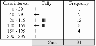
-Grouped Frequency Table:
Shows hoe many times data occurs in a range.
-Histogram: Compare number of
data items grouped in numerical intervals.
Order does matter.

-Bar Graph: Compare number of
data in grouped categories. Order doesn’t matter.
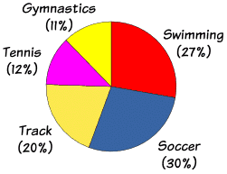
-Circle Graphs: Circular region partitioned into sections. Each section equals a part or
percentage of the whole.
-Line Graphs: Consecutive data
points are connected by line segments.

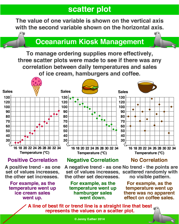
-Scatter Plots: Relationship between
variables cannot be depicted by a broken line.
No comments:
Post a Comment